
At the center of digital transformation is data democratization, whereby every organization tries to make data accessible across all its departments.
The volume of data collected within a business is growing steadily, calling for a better means to present it when creating reports. In addition, business leaders are experiencing challenges when visualizing vast data sets to generate actionable insights.
Data visualization aids in the visual presentation of complex information to enhance the consumption of the information by the readers. Researchers have revealed that the human brain can process visual content within only 13 milliseconds.
This indicates that presenting your data using the visual approach enhances the mode of communication within the business environment. However, there is so much that you need to learn about data visualization, especially in terms of improving business operations.
What is Data Visualization?
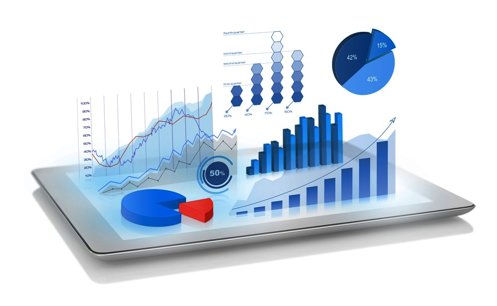
Data visualization is the representation of information and complex datasets in a graphical format. Visualization is a general term that covers all the other aspects, such as google sheets charts, excel charts, graphs, and maps.
The primary goal of data visualization is to transform information into a format that everybody can read and understand and ensure that data is highly accessible.
Data visualization is essential, especially if you want to uncover trends, and patterns, and even when you want to track the outliers. According to researchers, the data visualization sector is expected to grow dramatically within the next five years.
The expansion in the market size of data visualization is said to be triggered by the development of data democratization and digital transformation. On the other hand, the rise of all these technologies is mainly influenced by the developing interest within the business intelligence sector.
3 Benefits of Data Visualization
Data visualization benefits are evident within different sectors where it’s applied accordingly. Let’s check out some of its benefits!
1. Enhances Data Accessibility
Currently, you can use data visualization to make your data easily accessible to many users across your market audience. When you visualize data, many people within your market base can easily access it and use it accordingly to make decisions impacting their lives.
This is a clear indication of the role of data visualization in data democratization which is crucial within every business.
Besides, the visualization tools have the ability to digest complex data sets and convert them into a simple format that is easy to read and digest.
As a result, this helps all your team members to read on the same page since not everybody has the skills to digest complex datasets. This helps in upskilling your team members and enhancing the efficiency of the business.
2. It Makes Big Data Easy to Digest
The amount of data generated daily continues to increase. If you combine this growth with the advancement in IT systems, you will realize that you have a colossal pain point within your business. This massive amount of data is not easy to digest using the manual method since multiple aspects need to be covered before you get in a better position to understand the data.
The data visualization tools help in crawling across massive amounts of data to bring out a clear meaning that everybody can understand. You can opt to use the automated approach, whereby the tools operate in patterns to process and analyze data to generate insights used in decision-making.
This makes it easier for companies to utilize all the data generated from their daily operations in making prudent development decisions.
3. Enhances Efficiency and Understanding
The ancient means of sifting through data were considered to be time-consuming and meticulous in nature.
The introduction of data visualization enables business leaders to discover data insights easier and at a faster rate compared to how things were done in the past.
Remember that businesses generate a lot of data that needs to be visualized at a quicker pace to avoid piling data that may affect the business’s efficiency.
The dramatic growth in data scalability indicates that the business stakeholders have expansive room to enable them to remain effective in accomplishing their data visualization needs.
When data is mapped out of the way quickly, it gives data professionals a chance to generate more complex insights from the daily data generated by the business.
Before the introduction of data democratization, there were multiple gaps within the communication sector.
The introduction of different data visualization tools has changed the reality of things, given that data is processed and reports generated in real-time which has helped mitigate gaps within the business data.
3 Types of Data Visualization
There are multiple data visualization types that are used on various occasions depending on the nature of the data you are analyzing. Let’s explore some of these types of data visualization.
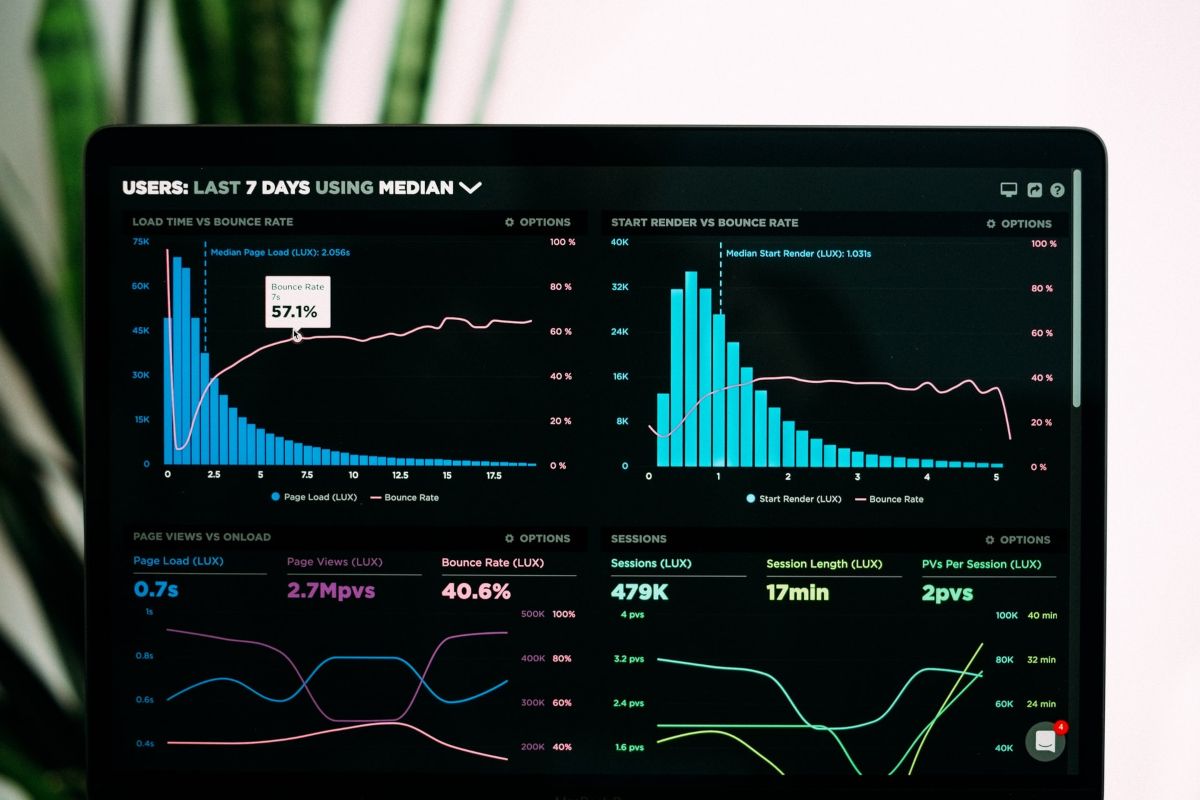
1. Dashboards
Dashboards play a massive role within businesses that intend to visualize their operations at a centralized point. They operate by focusing on specific details and images that change depending on the amount of information that passes through the system.
This data visualization type makes it easier for the business team to make conclusions easily depending on the data that has been presented to them.
Besides, when you have all your visualization needs covered at a single point in form of different charts and graphs such as a simple bar chart, timeline chart, or dot plot chart, it becomes easier to get an objective view of what is happening within the organization.
If you want to track the entire supply system and the human resource department, this is the best option for your needs.
2. Histogram
A histogram is a data visualization type mainly designed to visualize specific changes in data over a stipulated duration. The chart has the ability to group data into different bins and display the changes in the form of data frequency.
The most common application of histograms is highlighting the primary survey responses after conducting a market analysis activity.
After collecting responses from your market audience, you need to feed the information into a histogram to help you leverage market opportunities and tailor strategies that suit your preferred audience.
3. Column Chart
A column chart is said to be an inverse of a bar chart. This data visualization type is one of the most common tools you can use when comparing different data sets.
Note that you can tailor your column chart in a manner that allows it to track particular sets of data within a specific period. This chart type is usually used to present sales figures or outline the social media market trends.
3 Data Visualization Best Practices
The ultimate goal of data visualization is to ensure that data is presented in the best way possible that can attract the attention of your preferred audience. To make this happen, you need to consider visualization best practices outlined below.
1. Leverage on the Color Application
Color is considered to be subtle and also the most effective methodology that you can use to map data. You must be extremely careful with your color choice since it should reciprocate the information you display.
For instance, you can use the red color to showcase an increase in temperature and blue to indicate cold. This is a necessary consideration, especially when outlining weather patterns.
2. Choose the Most Suitable Graph or Chart to Present Your Data
Before choosing the best chart type to use in data presentation, you need first to consider your needs. Evaluate whether you want to track data over a particular time or the number of variables that you intend to analyze.
If you have a clear definition of your data needs, you will find it easier to choose the best chart or graph type to help you solve the problem.
3. Utilize Templates
Most data visualization tools offer templates that you can easily acquire and outline your data. Instead of wasting much of your time, you can choose one of the best templates provided a d craft an engaging visual that presents your data in an appealing manner.
Note that templates give you better room to jumpstart and get things running without struggling.
Final Word
Data Visualization offers the best way of presenting data to your audience without struggling using the manual approach. When you invest in high-quality infographics, your data is 30 times more likely to be read by your target audience.
However, you can only get the best out of your visuals if you consider the best practices and choose the right chart type to present the data. Also, you need to spell out clearly all your data needs to be able to acquire the best data visualization type that suits your needs.
Read Also:
- Why Businesses Need to Have a Good Data Destruction Policy
- How The Blockchain Can Protect Your Fintech Data
- 7 Business Data Management Tools That Can help You Grow
Author Bio: Ryan Erwin


